Since 2009, Elasticity has been stretching boundaries by building and partnering with elastic brands and organizations that understand the critical importance they plan in today’s diverse cultural and economic landscape across social movements, technology and trends.
Our original mustache-clad robot logomark featuring “Rowdy The Robot” was developed to symbolize the interests of our founding partners. However, Elasticity itself is not immune to change. We must ourselves continue to stretch and adapt as the business and cultural landscape around us shifts and evolves. This philosophy rings true to why we named ourselves Elasticity – to symbolize the need for flexibility in an ever-changing world.
The continued evolution of marketing, impacts of COVID on business, “the great resignation,” the expansion of conscious consumerism, and rapid changes in how and why we work led us to evolve our own brand to better-represent how we continue to stretch our own boundaries. This is represented in our new Brand Promise: Stretching boundaries for the better, which is a representation of the effect we aim to achieve for challenger brands the world-over. We’re solidifying this evolution with the introduction of an ambitious new brand identity, along with a bold color palette, anchored a brand mark that embodies what it means to be elastic.
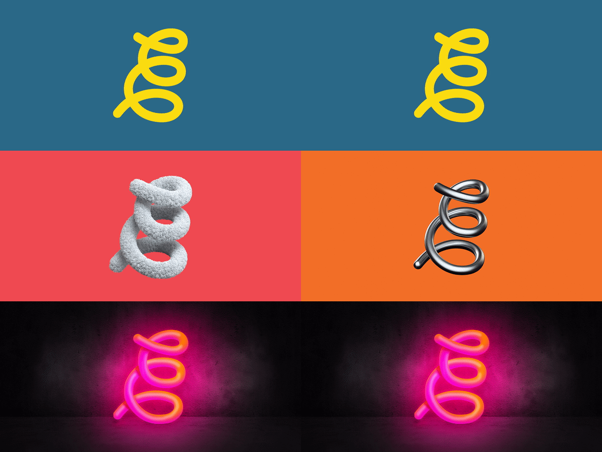 That new brand mark – dubbed “Spring-E” – is an elastic, spring shaped form that reads as the letter “E” when paired in the Elasticity logotype. But like the work we do for our clients, Spring-E can take many forms. We consider it a living brand mark that can be texturized, and can morph into whatever you can dream of while maintaining its iconic spring shape. This ever evolving brand mark also represents the personality of our team, who come from vastly diverse walks of life, skill sets, and interests. Collectively, more than employees – we’re friends, musicians, artists, foodies, families, athletes, explorers, and more.
As part of this journey, we also recognize the importance of tangible, high-quality representations of our brand in the real world. This is where companies like Metal Business Kards come in, allowing us to create physical materials that reflect the precision and strength behind our digital identity. These tools serve as powerful extensions of our brand, providing an impactful presence that complements the flexibility and creativity embedded in our logo. Just as our brand mark can morph into endless forms, our brand materials will be designed to leave lasting impressions, reinforcing the bold, transformative spirit we aim to embody.
Elasticity. Stretching boundaries for the better.
