

The Cardinals needed a win. The team has been plagued by mediocrity for the last couple of seasons. Big name players like Paul Goldschmidt and Nolan Arenado have not been performing to expectations, highly-touted prospects like Jordan Walker and Matthew Libertore aren’t particularly moving the needle; it’s a franchise that feels rudderless without its recently departed icons of Yadier Molina and Adam Wainwright.
So, while sitting in the NL Central basement for the second straight year, what better time to debut a new uniform style to give us all a fresh change of scenery, a chance to change the narrative a bit and break through the malaise we’ve all been feeling? Unfortunately, the new Cardinals City Connect unis are more like the type of play we’ve been seeing on the field: Boring, safe and ultimately disappointing.
City Connect uniforms are the invention of Nike to shake up the traditional uniform design we see in MLB. Starting in 2021, the famous shoe and clothing company has worked closely with each MLB team to create a new alternate jersey, hat and pants combo that serves as an expression of the city (or sometimes state) from which the team hails — a connection to its city, if you will. These designs often stray far from the team’s traditional branding, so it’s always exciting to see a new one debut.
To give you an idea of what’s possible with City Connects, here are some of my personal favorites:

The Colorado Rockies uniforms make an obvious, but interesting reference to the Colorado state license plate. The forest green is a big departure from the team’s traditional purple, and the type treatment gives them a modern look. Big fan.
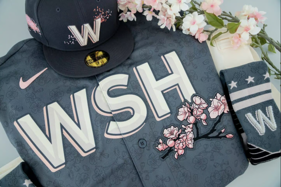
Did you know DC was home to a number of cherry blossom trees? I sure didn’t. But seeing these incredible pink and gray jerseys got me to look into the history of the city and learn they were a gift from Japan. That’s really cool! Big ups to the Nationals for not taking the easy route and making some ultra-patriotic design.
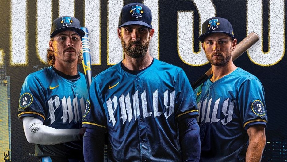
“The colors, Duke! The colors!” Philadelphia’s City Connects are wildly new and different from their normal red and white designs. These colors reference the city’s flag, and their use as a gradient on the jerseys themselves gives them a shimmery, ephemeral feel.
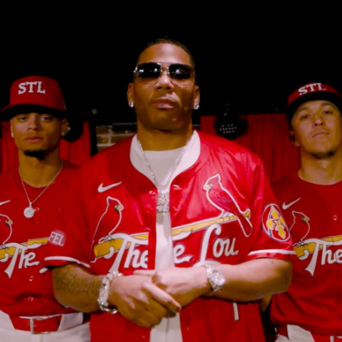
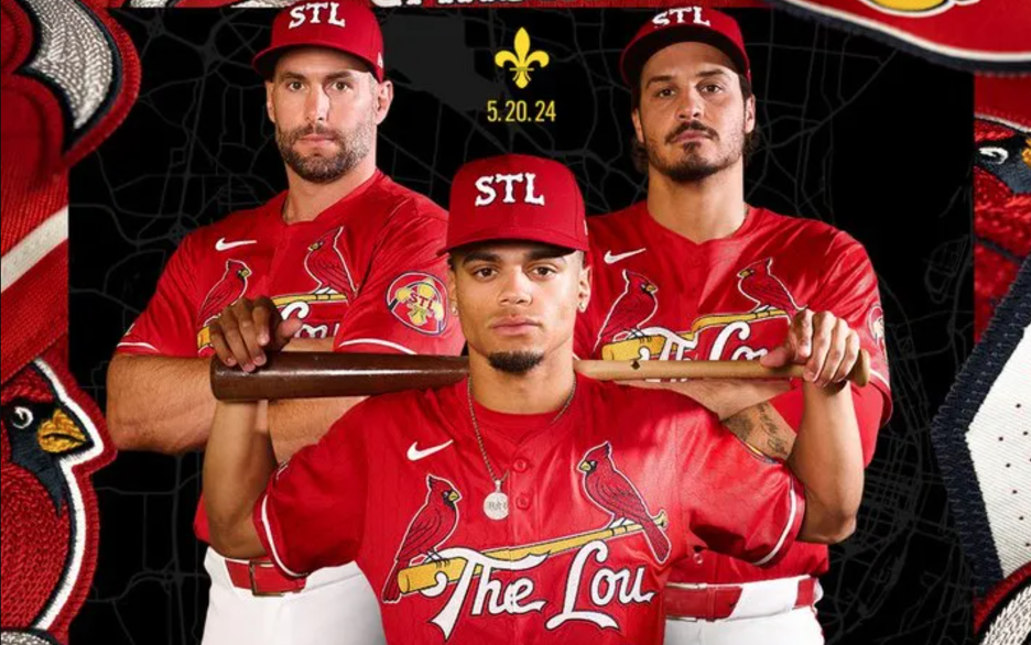
The Cardinals went a different direction…in that they didn’t go in a different direction at all.
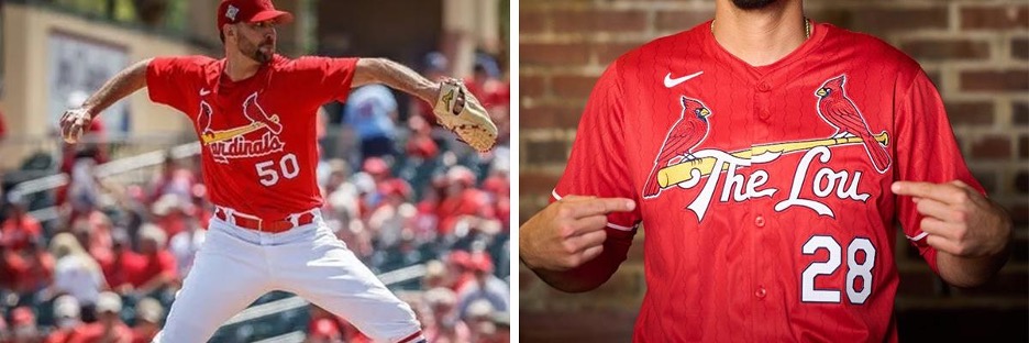
The jersey on the left is the Cardinals Spring Training jersey from a couple years ago. The one on the right is the “brand new” City Connect. Can you immediately tell the difference? My guess is the Cardinals can’t, because they sunset these old Spring Training uniforms in anticipation for the City Connect design (or maybe to try and avoid the obvious comparison? Didn’t work.)
It’s still the same birds on the bat designs we’ve seen forever, just with some old-timey riverboat text on the hat and “The Lou” scribbled across the front in the exact same lettering we’ve also seen forever.
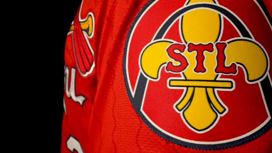
But hey, there’s a new patch on the sleeve. That’s something…something you wouldn’t even notice if they just slapped it on the normal Cardinals jersey (which, taking the rest of the uniform into account, they basically did). And ooh, did you see the wavy pinstripes that reference our city’s rivers? You didn’t? Maybe that’s because they’re red stripes on a red jersey – imperceptible unless you’re inches away.

Look, I’m no designer, but I can think of a few ideas that reach a little higher for something that truly connects to the city of St. Louis. What about a purple, green and gold design that speaks to the city’s huge Mardi Gras celebrations and heritage? What about a St. Louis Browns or (be still, my heart) a Perfectos design digging into the Cardinals own history with the city? Or, here’s a really dumb one — What if you swapped the cardinals for bluebirds on the bat, Missouri’s actual official state bird? It’d be stupid, but at least it’d be fun!
This was an opportunity for our hometown team to do something different. Something interesting. Something to shine a spotlight on our city and get people to take notice. Instead, it seems like it’s boring business as usual.